rop cap anyone? For those of you who design your books for print, this website is a gem and a must see. If you don’t design your own books but love imaginative yet practical art, you must also visit The Daily Drop Cap where graphic artist Jessica Hische has designed 12 alphabets for non-commercial use, each one more inventive and fun than the next.
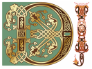
But what’s a drop cap you say? Look at the first letter of this post. You’ve seen it and may have envied it, that graceful “I” of “It was a dark and stormy night,” trailing the opening of your book. Open any classic, a book that takes itself seriously, say medieval manuscript, and you’ll find the first initial of the first word at the beginning of a chapter enlarged and set within a decorative image. The monks of old would create masterpieces around these letters.
Vellum allows it, though considerably less fanciful, in several of its templates.
Microsoft word offers it as a drop cap in the Format menu. Their initial wraps the remainder of the text around it so you don’t have spacing problems with next lines.
Dave Bricker’s book designer blog gives an in-depth explanation of all the variations on decorative first initials.
As I said, even though you may not be a buyer in a museum, it’s always fun to look at the pictures.
Enjoy.
Helen
Visit me here: DailyWritingCoach
 RSS Feed
